Perlmut by la famiglia fluhberg
Packaging Design
About the Project
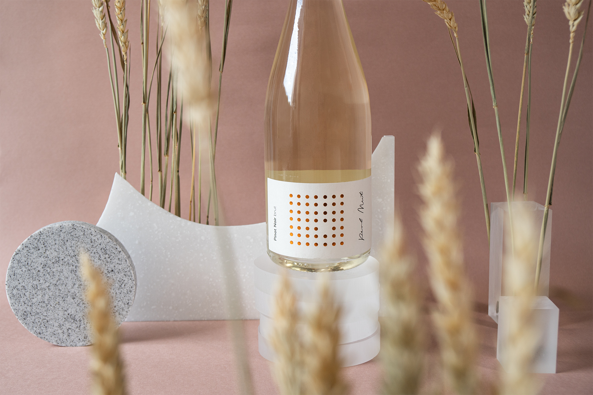
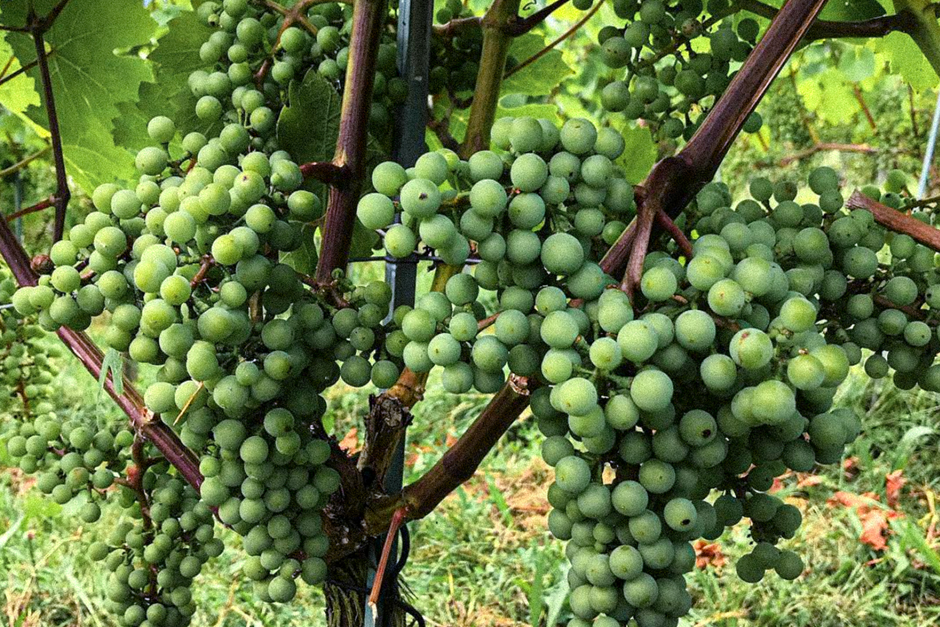
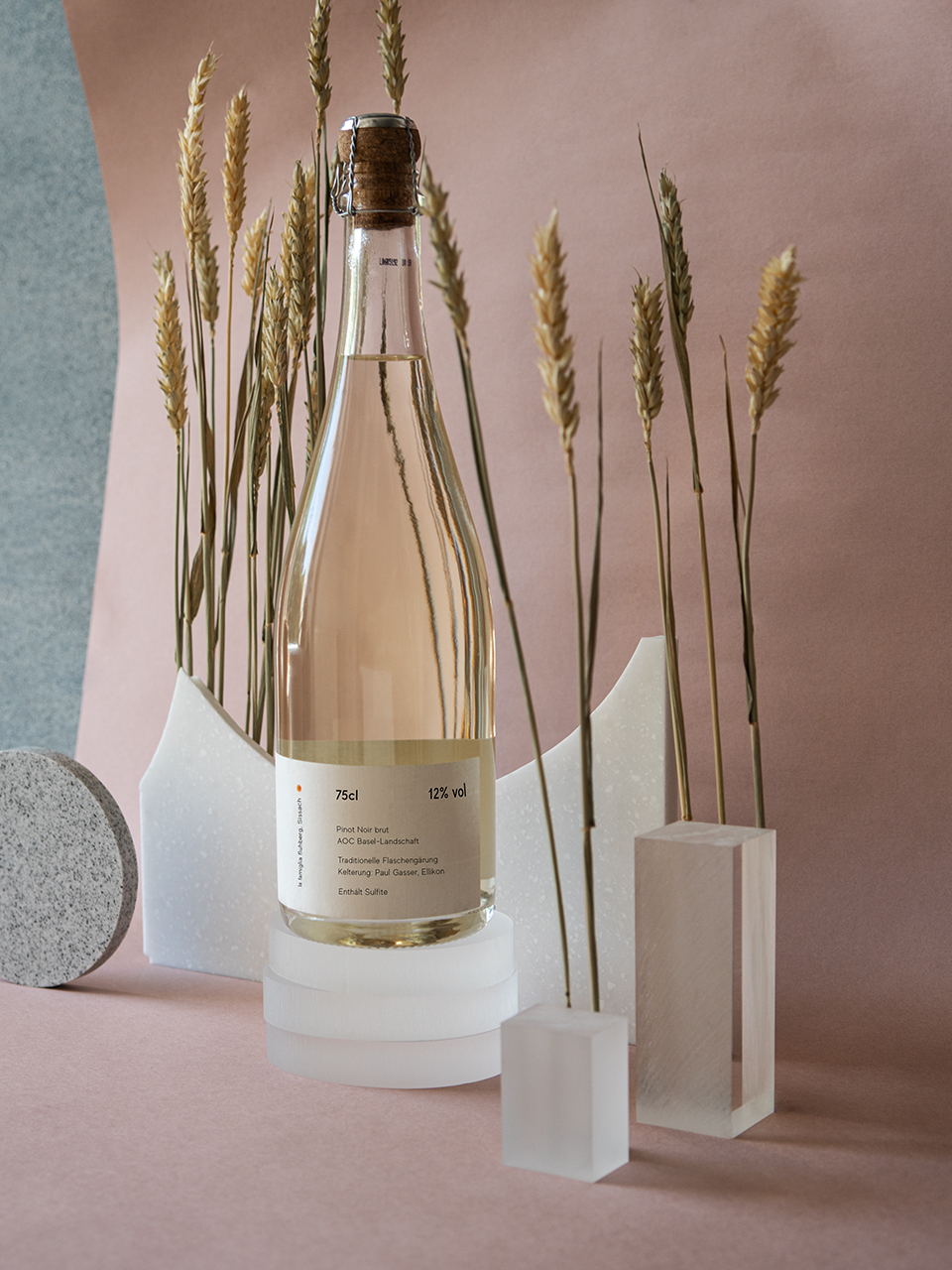
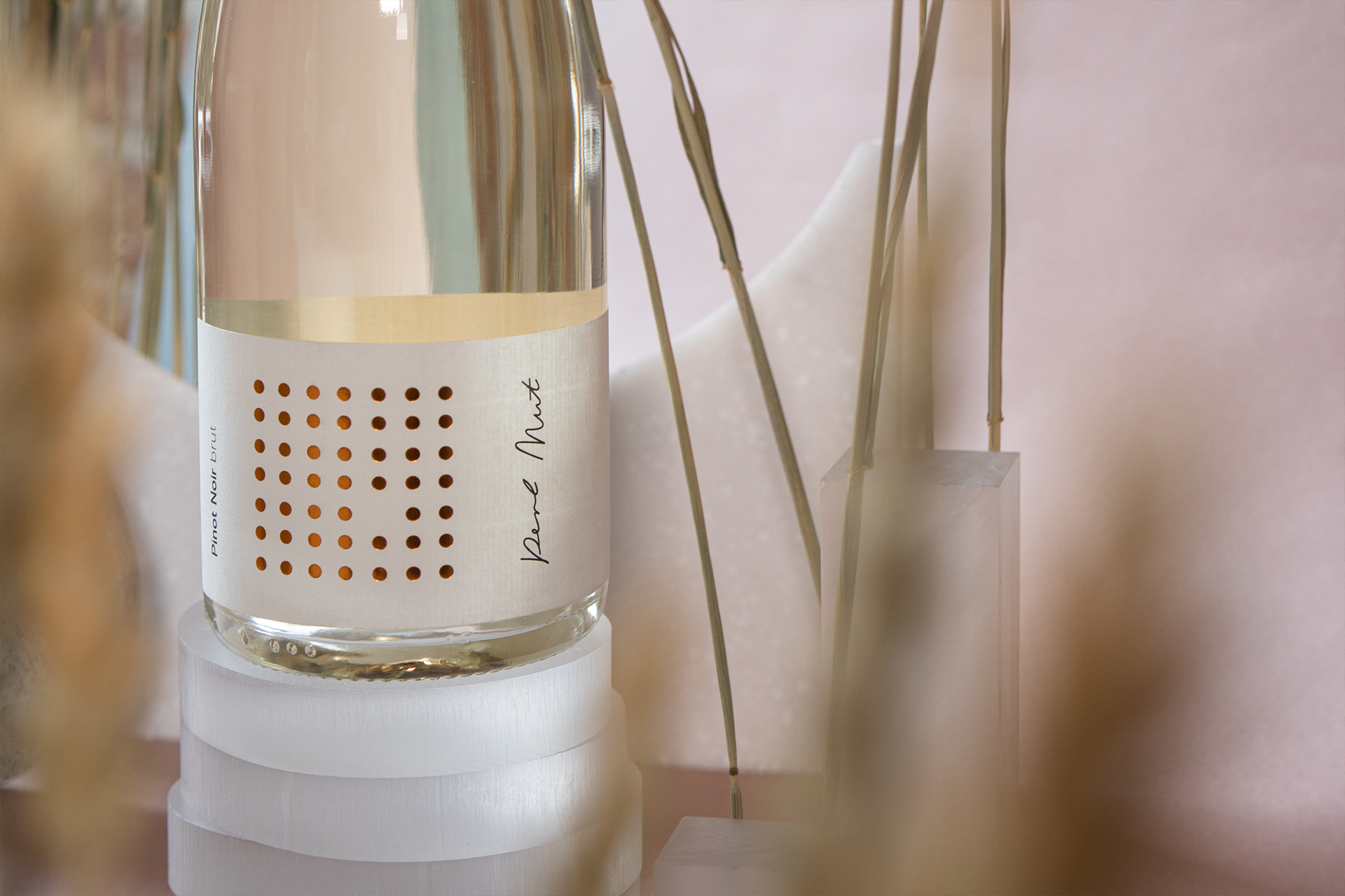
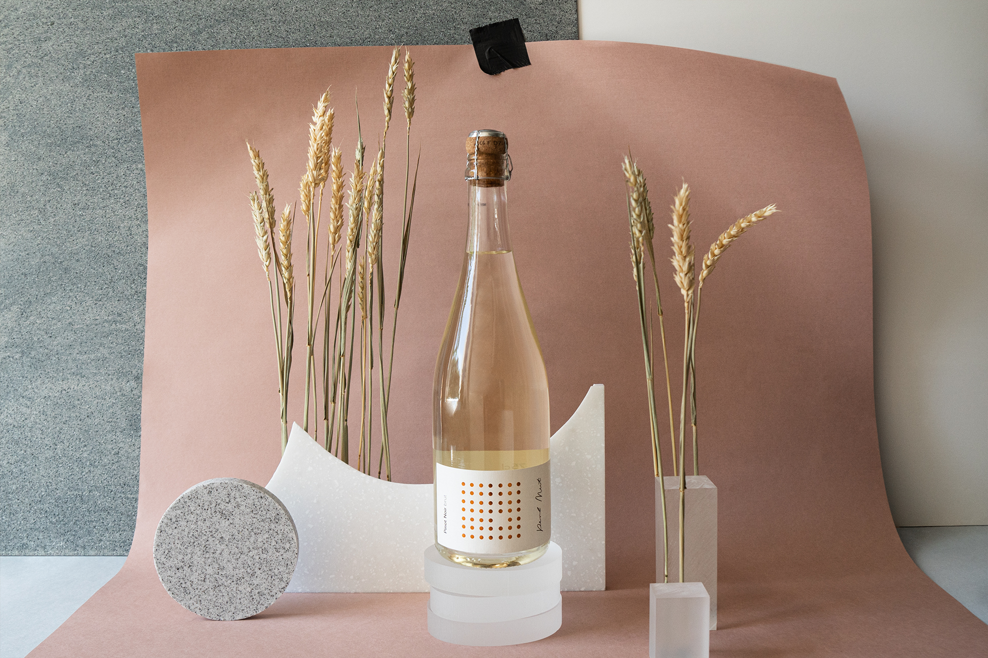
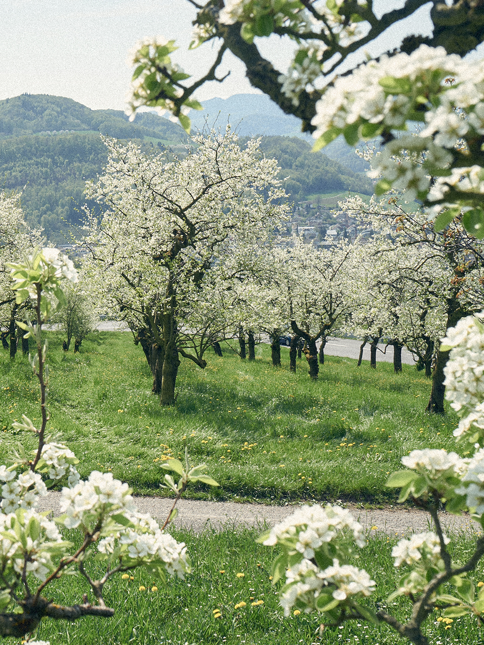
The 200-year-old family business of la famiglia fluhberg grows an impressive selection of fruit varieties and produces high-quality wines. Perlmut, their Pinot Noir sparkling wine, feels special yet operates with simplicity. For its label, we used a handwritten logo type, combined with a classic grotesque typeface. A copper embossed pattern, as simple as it is, gets your attention. It translates the name in a bold but poetic way: the “brave pearl” (a pun on Perlmut) doesn’t fit into the grid and finds its own special place on the label.
»Give me bubbles! Whether wine or label – this outsider is not afraid to stand out.«

Services
Packaging Design
Art Direction
Print Design
Other projects
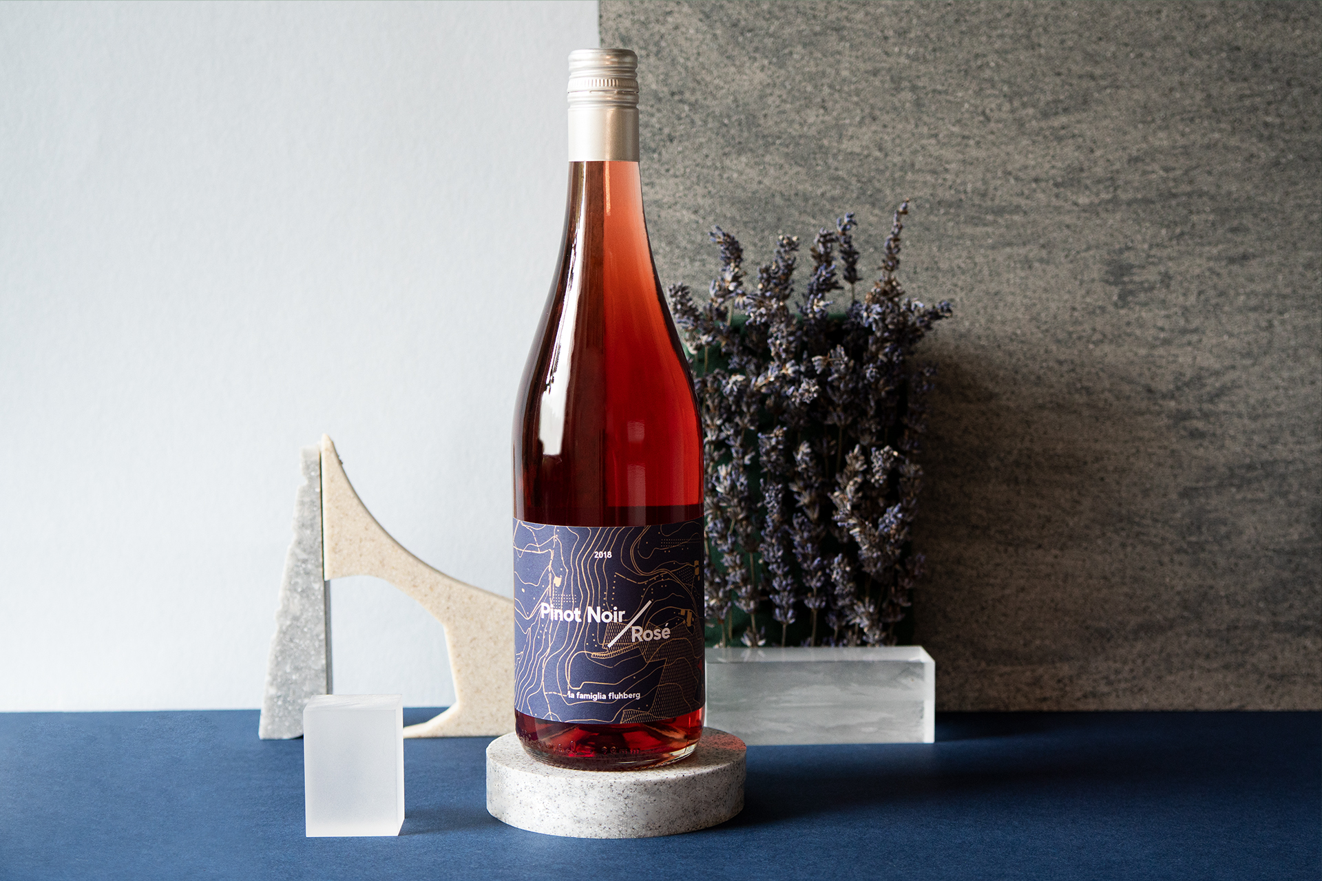
Winelabels for la famiglia fluhberg
Packaging Design
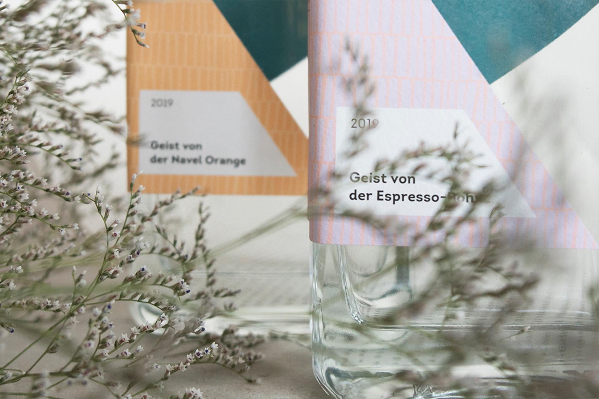
Destillerie Onsen
Packaging Design
Smuk Branding
Brand Development and Print