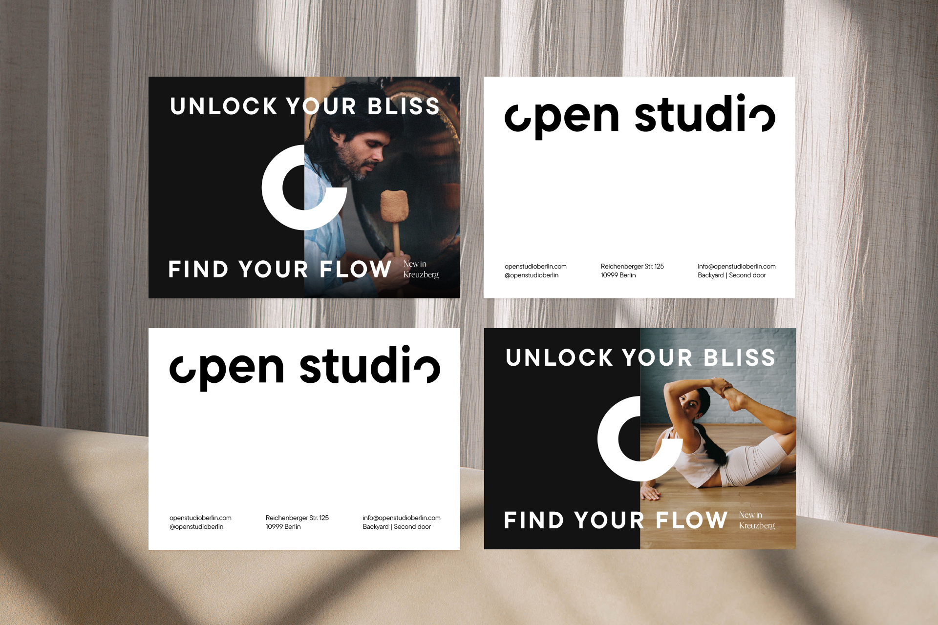
Branding for Open Studio
Web Design and Print

About the Project
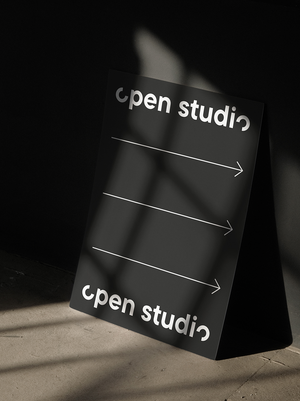
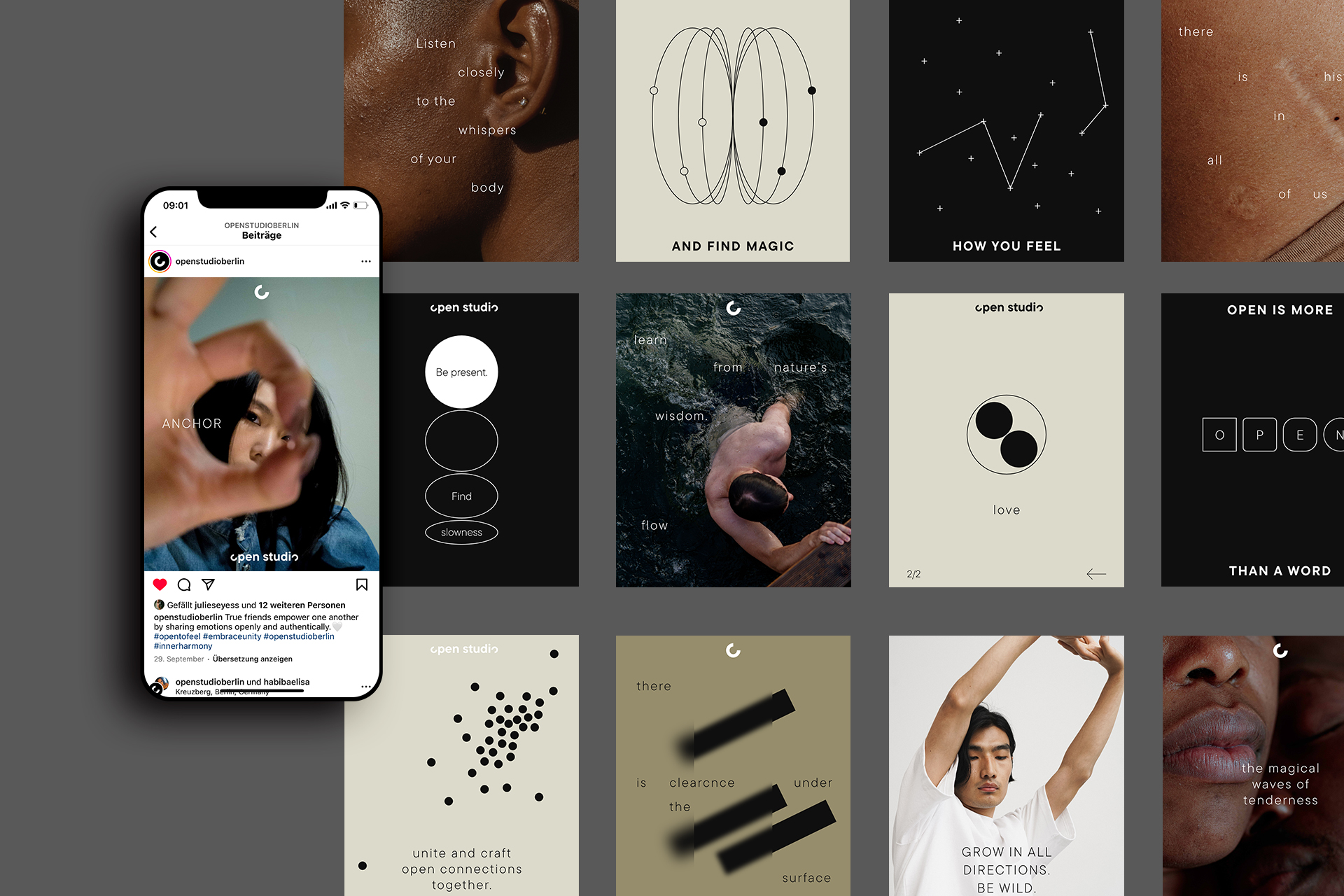
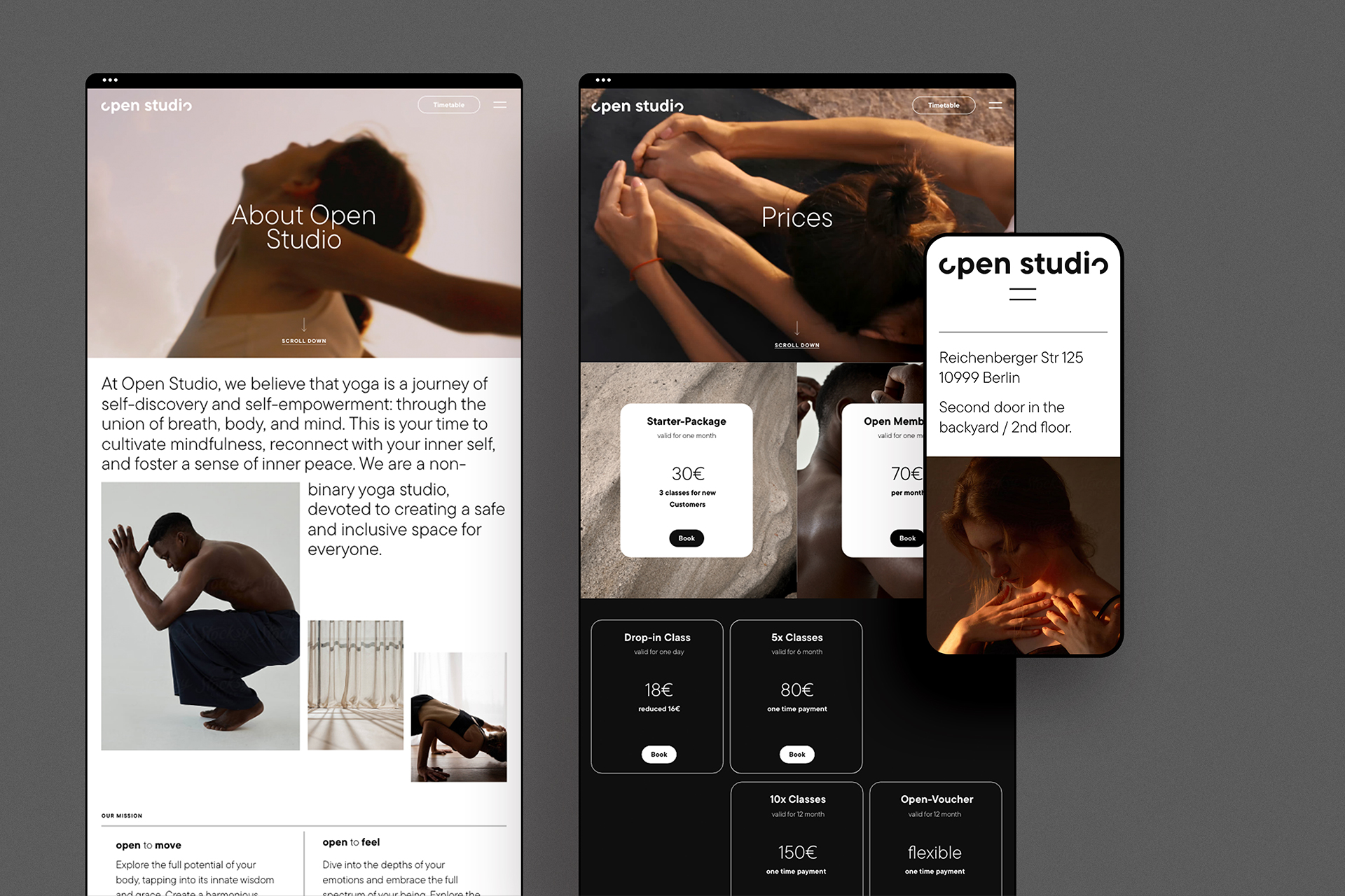
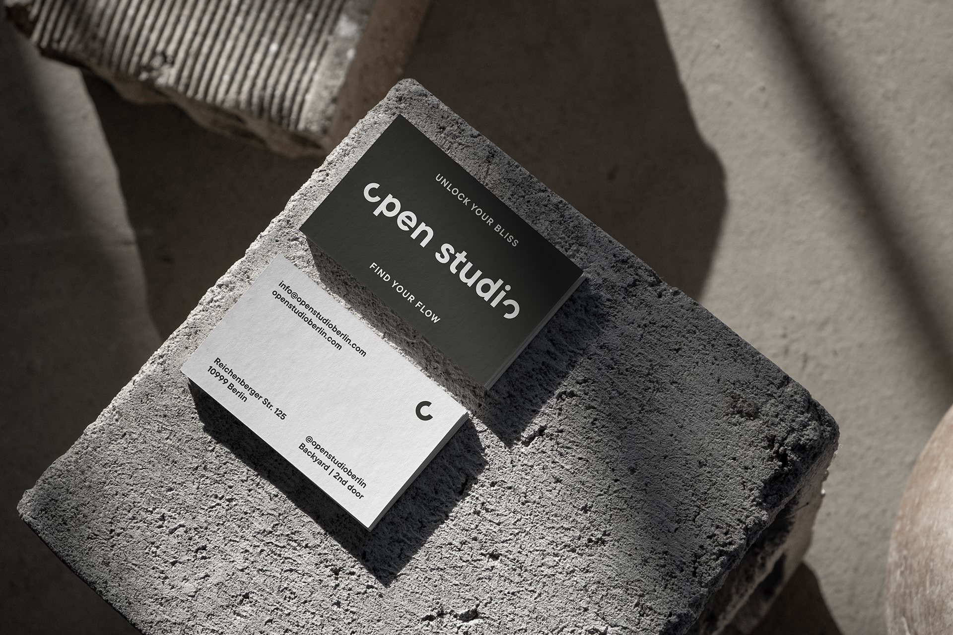
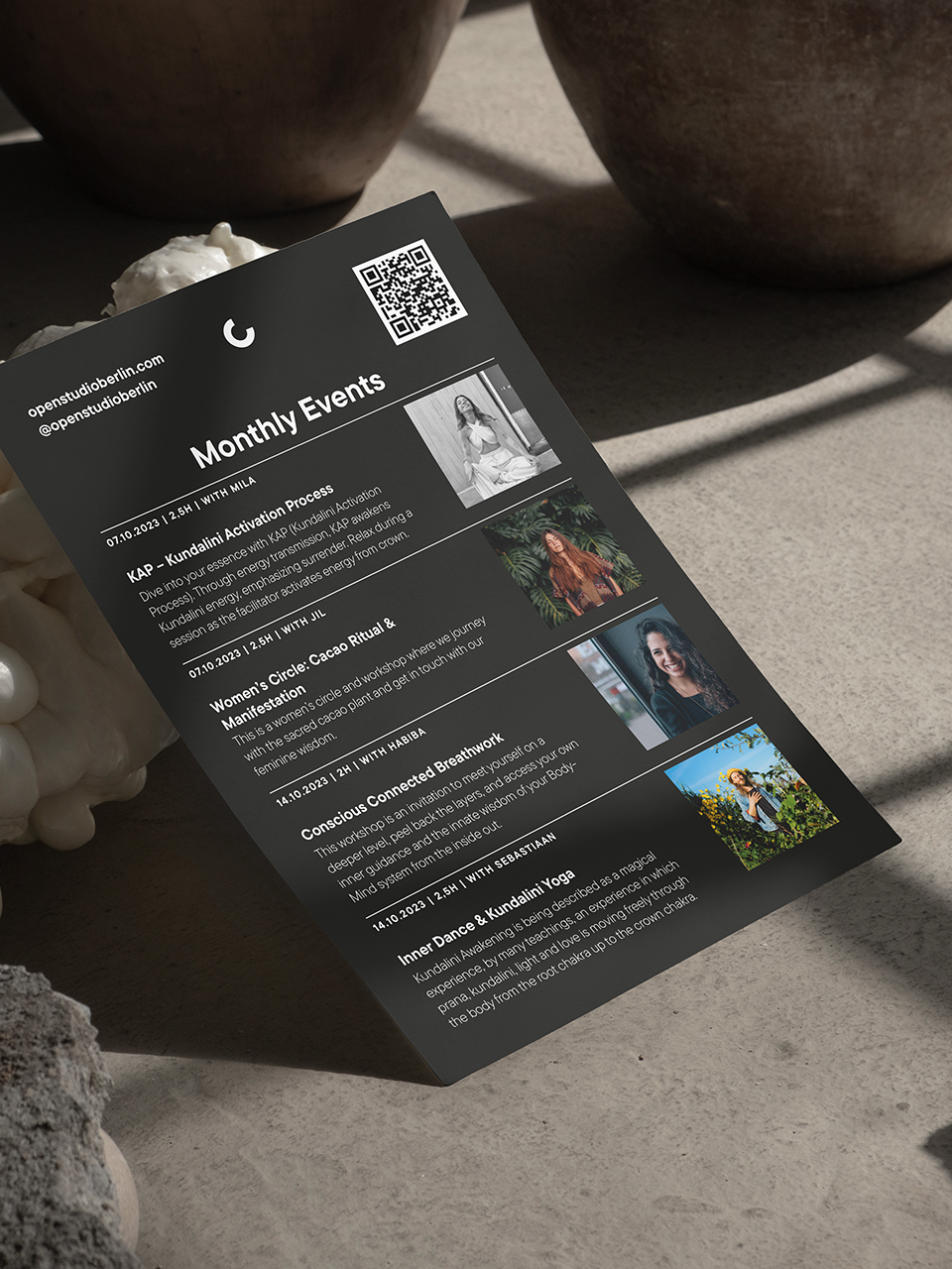
At Open Studio, design isn’t just about aesthetics; it’s an integral part of the identity. We’ve crafted every visual element to create an environment that reflects the essence of who they are. The logo consists of two open „O’s,“ one placed at the beginning and the other at the end of the word „Open.“ These open „O’s“ signify the freedom to explore and express oneself in various directions, emphasizing the importance of orientation and individuality. Warm earthy colors sets the tone of the studio as well. In the realm of visual language, we’ve meticulously curated a diverse and thoughtfully selected collection of images.
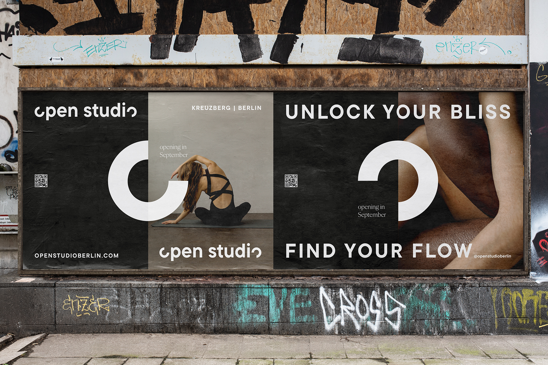
»The typography of Open Studio is a really important piece of the identity itself. It reflects the vision in a playful but clean way«

Services
Web Design
Print
Wording
Branding
Social Media

Other projects
BP X Corporate Branding
Brand Identity and Web Design
Smuk Branding
Brand Development and Print
We-Vibe Image Identity
Brand Development and Print
